Tried & True Paint Colors
When it comes to paint, there's a lot of ground (or walls, rather) that need to be covered. Picking paint can be a frustrating task, especially when there are so many options to consider, but it is a very powerful design component that shouldn't be overlooked. It can make your space feel light and bright, or dark and dramatic, which is why it is so fun to pick out shades with our clients. We've rounded up a few of our interior designers to share with you their "tried and true" paint color recommendations that they love to use. Scroll down to see swatches we love and how they look in real life!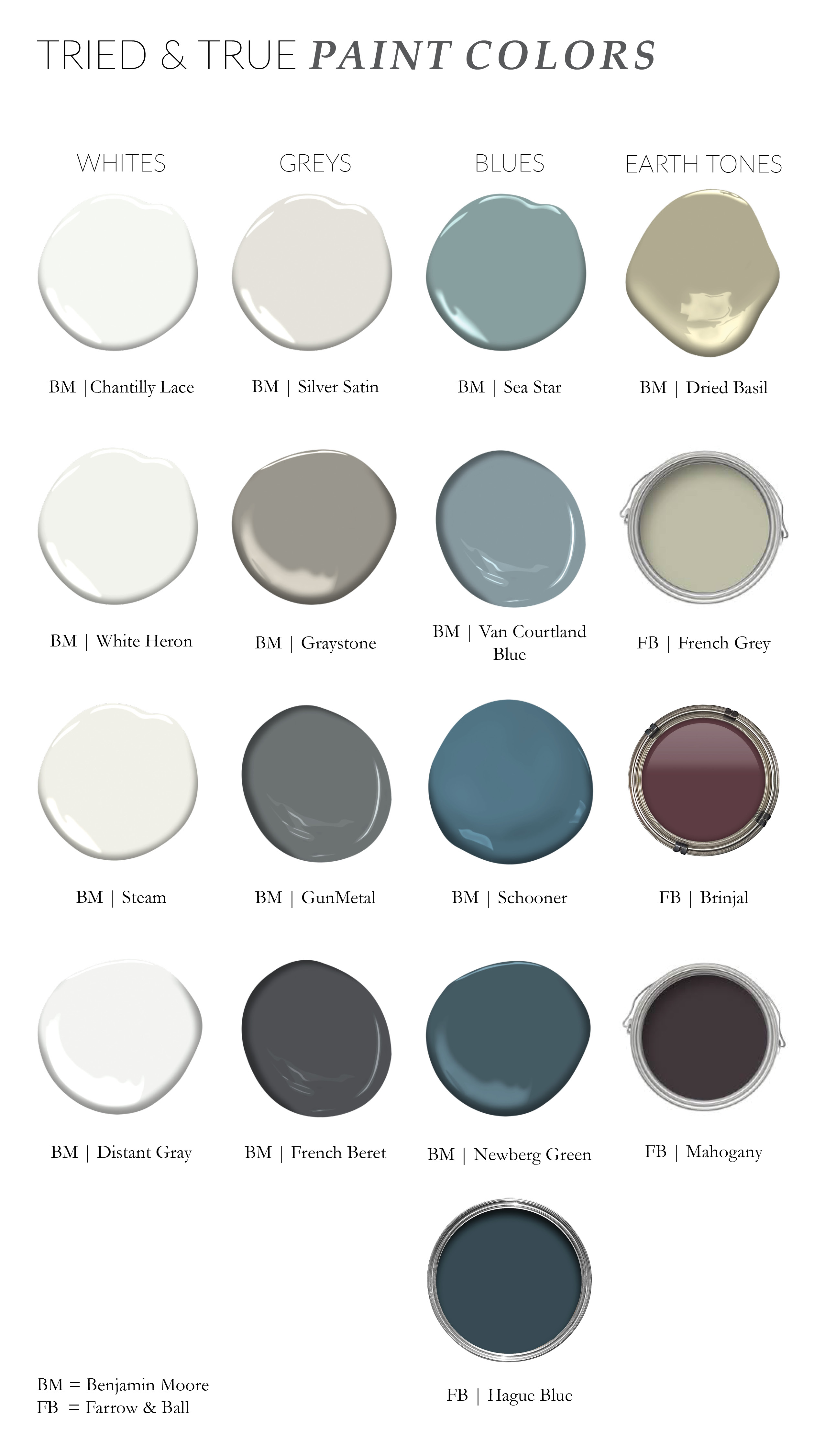
Benjamin Moore | Farrow & Ball
Narrowing down our favorite colors is only the beginning. Once you have your shades selected, you need to think of how it will match the rest of the room. Do you want a matte wall color with a satin trim? Or a glossy finish from floor to ceiling? Our biggest tip to you is to test these colors again and again! Paint chips unfortunately are not an exact science, so get a test pot and paint it on your surface of choice to get a real sense of how the paint reacts to light (or lack thereof) in your space. We love playing with different paint finishes to get a more polished look, and recommend looking into satin, matte, or eggshell finishes, because sometimes a subtle difference in finish can change the room drastically. Check out below how our designers would pair their favorite colors: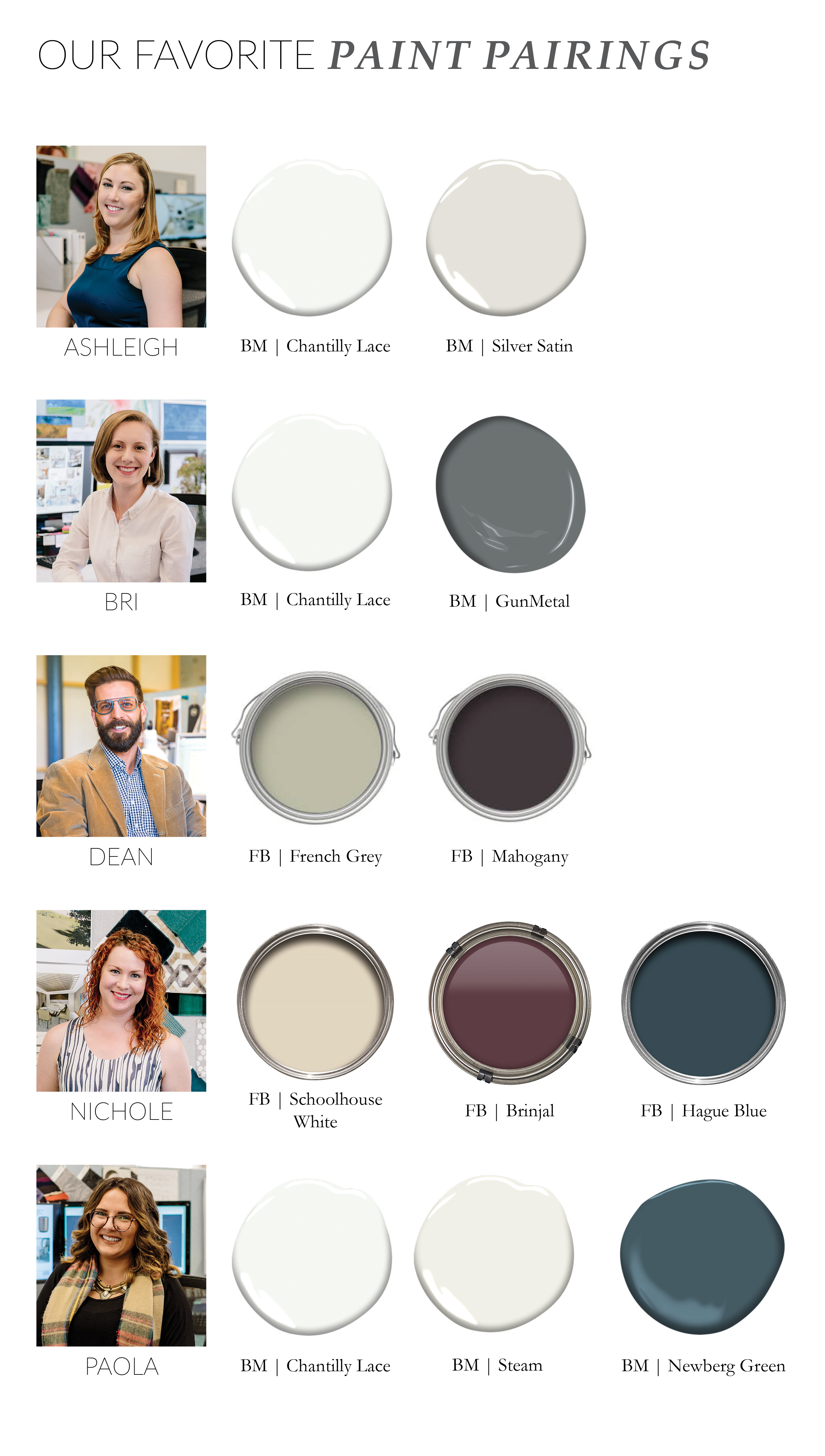
So now that you have seen how we would pair our favorite paint colors, let's see them in real life! Below are a couple of projects that showcases a few shades from our list:
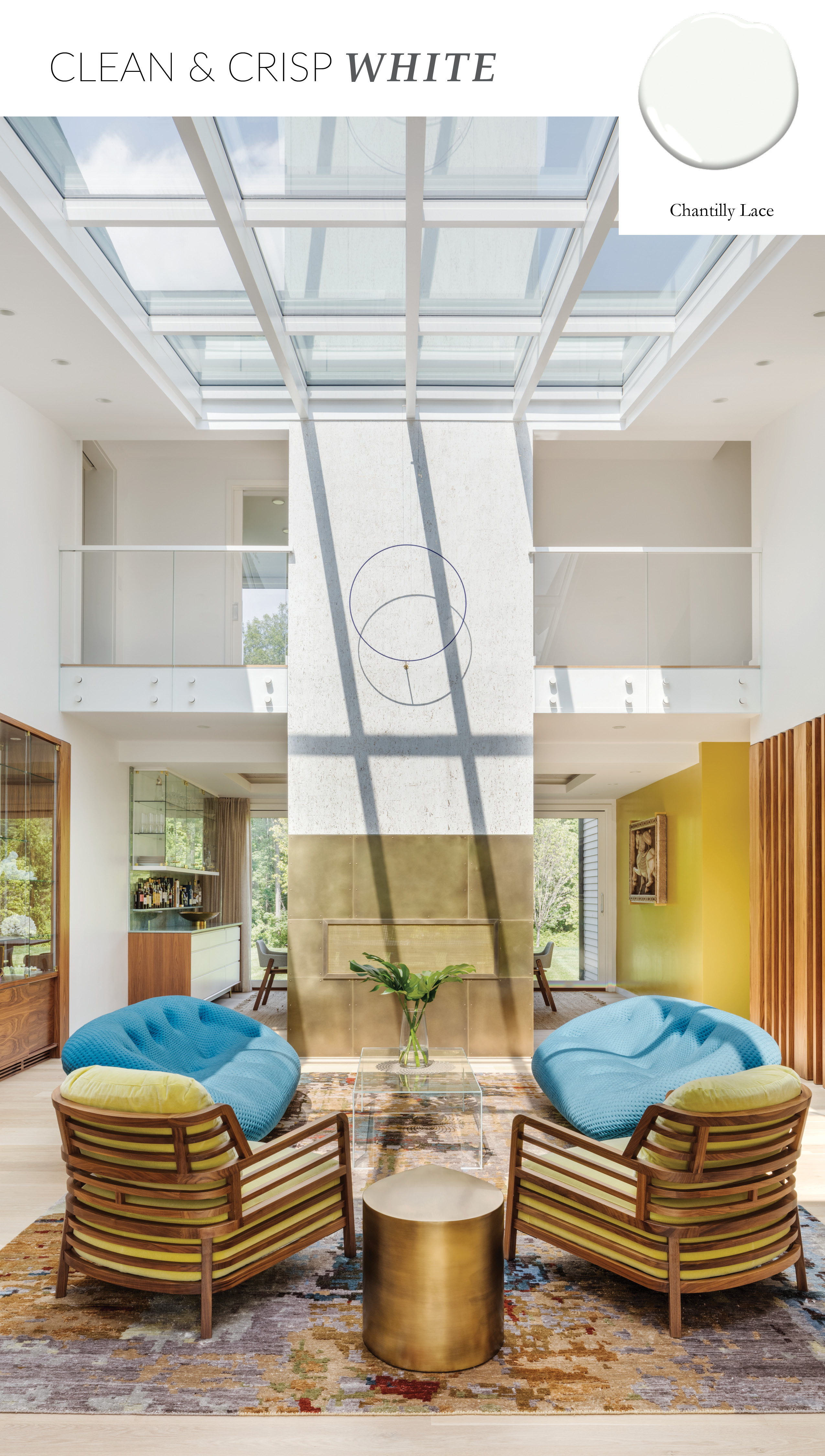
Blue Hills | Living Room
An all time LDa classic! This white is refreshing and crisp without going yellow or grey when paired with other materials which is very unique. Can be used as walls, trim, cabinetry or all three. Use different finishes from Benjamin Moore to add contrast— matte, glossy and eggshell; in case you like your white both shaken and stirred.
As you can see in our Blue Hills living room, the Chantilly Lace paired walls and ceiling look clean and crisp, even when paired with a daring chartreuse color.
Interior Designer, Ashleigh Sanicola, loves pairing Chantilly Lace with Silver Satin, “For me, it’s the ultimate neutral pairing. It can be warm or cool depending on the decor and complements any type of space.”
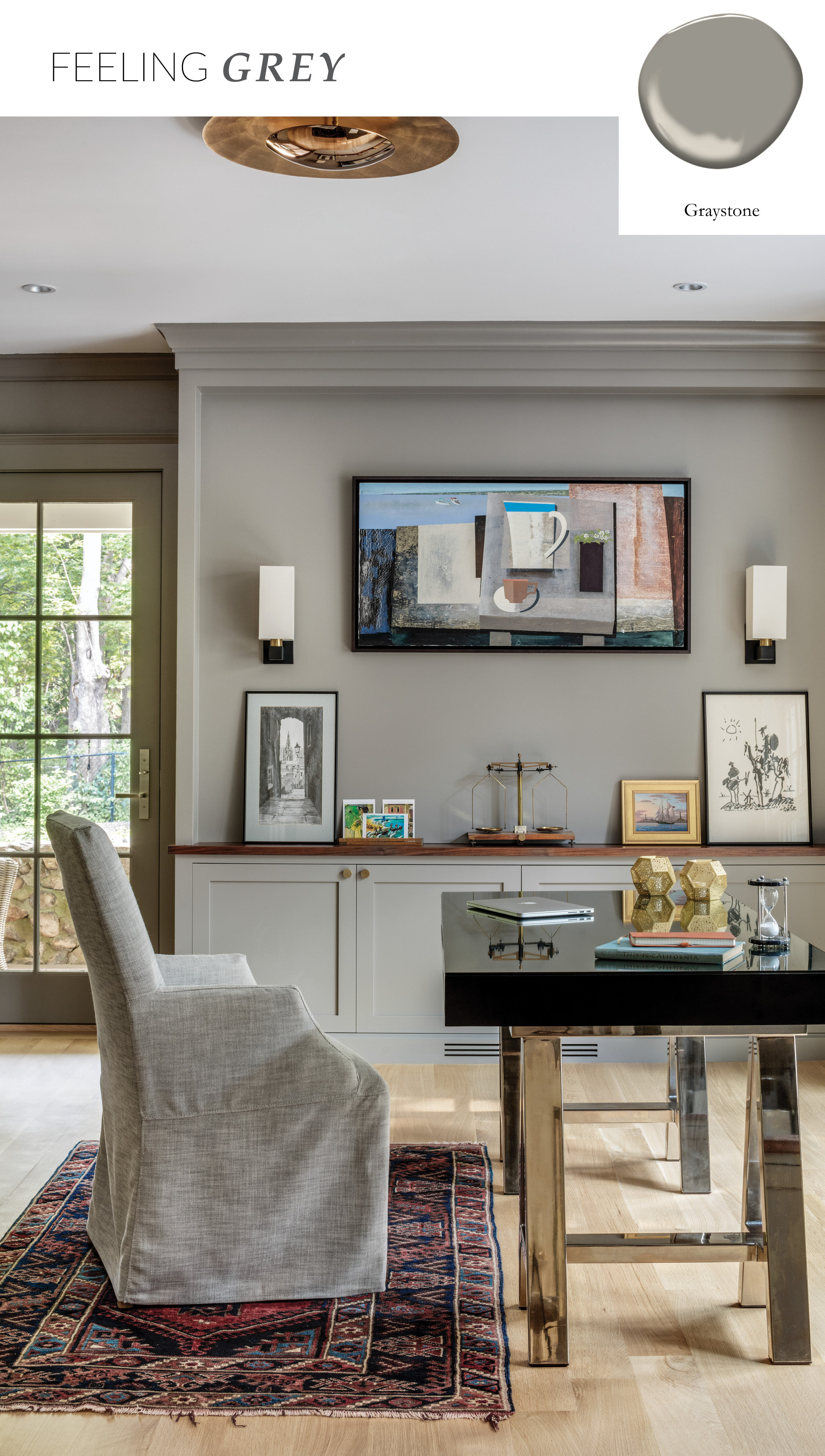
Fort Hill | Office
“Every home needs a strong basic that isn’t cold. This grey has warm undertones which makes it excellent to pair with wood accents,” says Bri Boidi, Junior Interior Designer.
In our Fort Hill project, we used Benjamin Moore’s ‘Graystone’ for cozy yet sophisticated feel in the office, which matches perfectly with the walnut wood countertops next to the wall to wall bookshelves.
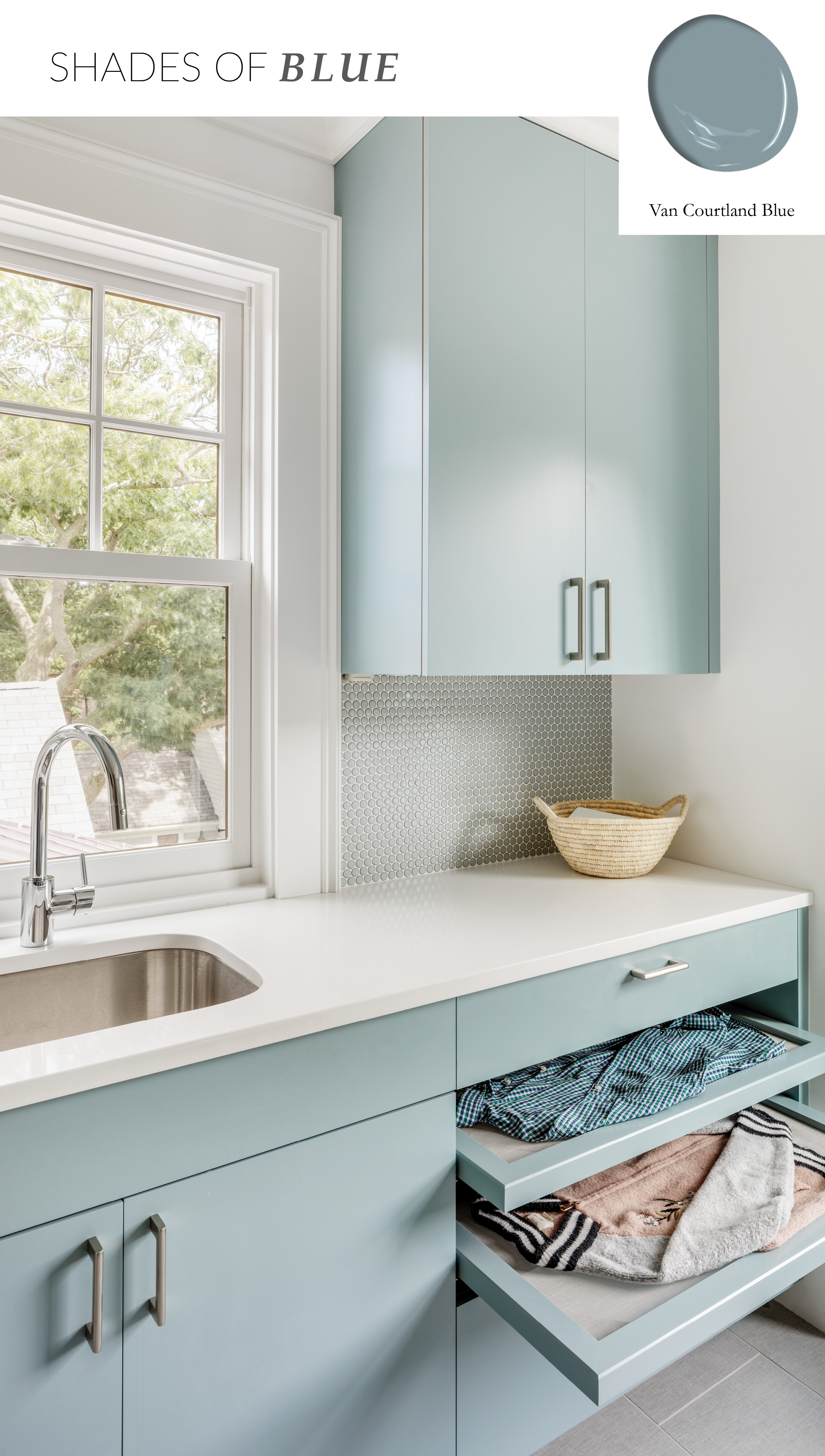
Fort Hill | Laundry Room
Benjamin Moore describes Van Courtland Blue as:
“A decorative Old World blue that works equally well in more contemporary spaces, this timeless shade effortlessly spans a range of styles and sensibilities.”
And we would have to agree! Interior Designer, Dean Sawyer, chose this particular shade for a coastal home’s laundry room. “We wanted to make the space fun despite it’s utilitarian nature-- it’s calming, bright and has a sunny disposition.”
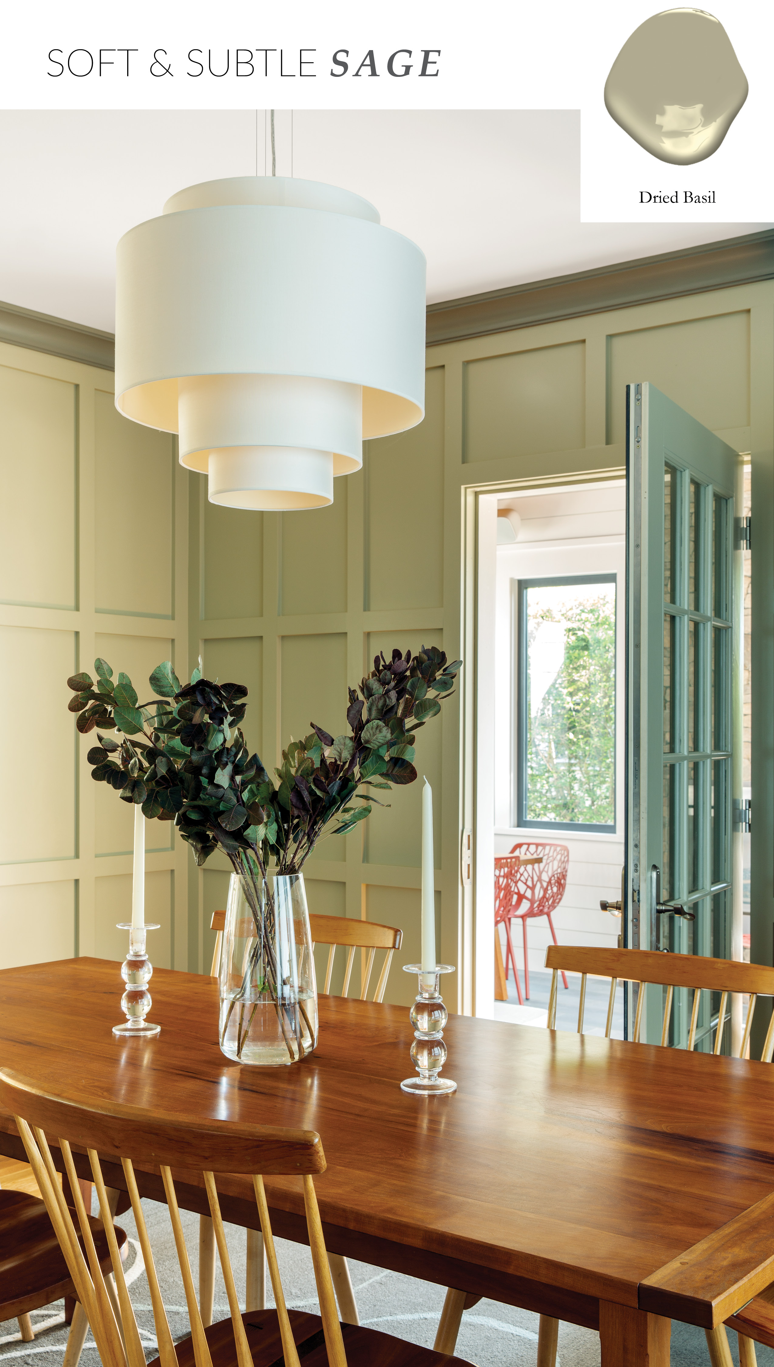
Walnut Hill | Dining Room
Sage— a color that is transcendent of it’s time and provides character in any type of space. It’s soft, while still eye catching and can be found in both traditional and transitional architecture. In our Walnut Hill project, we chose to paint the paneling in the dining room— adding warmth and a touch of brightness to the space, which also happens to connect to the adjacent sunroom.
We hope you enjoyed a bit of our color theories, and that this helps you when you're ready to tackle the next painting project in your home!